Conceptual project : Shillington brief
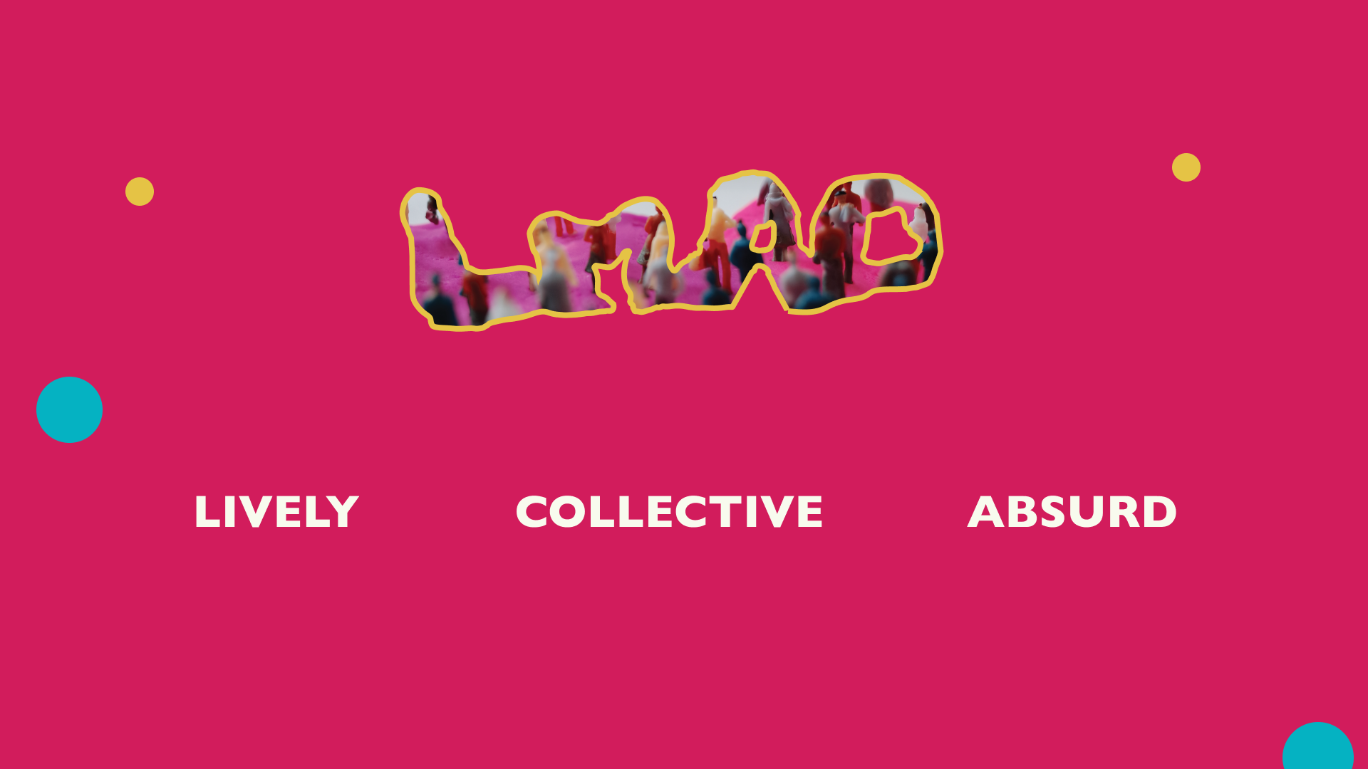
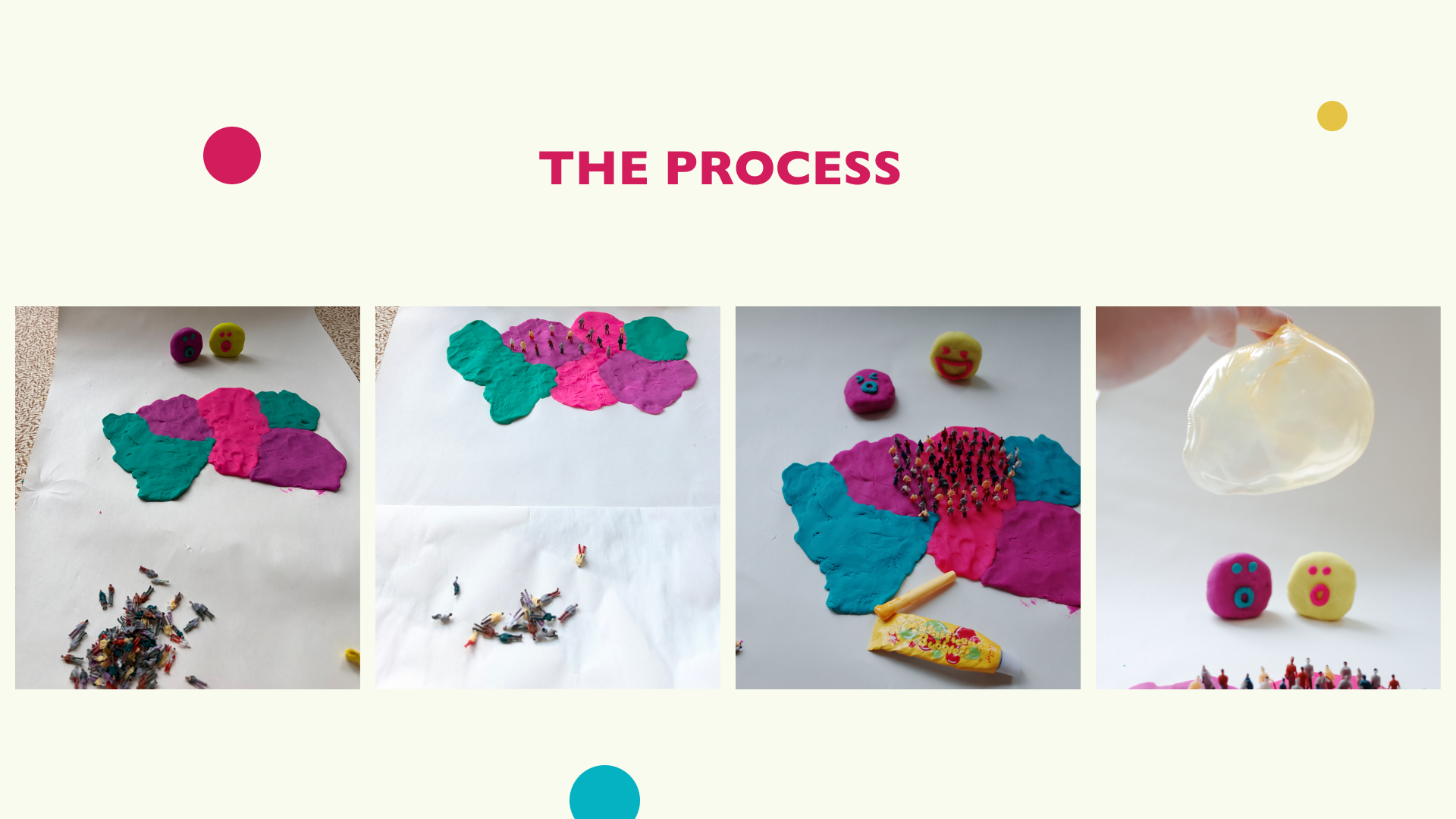
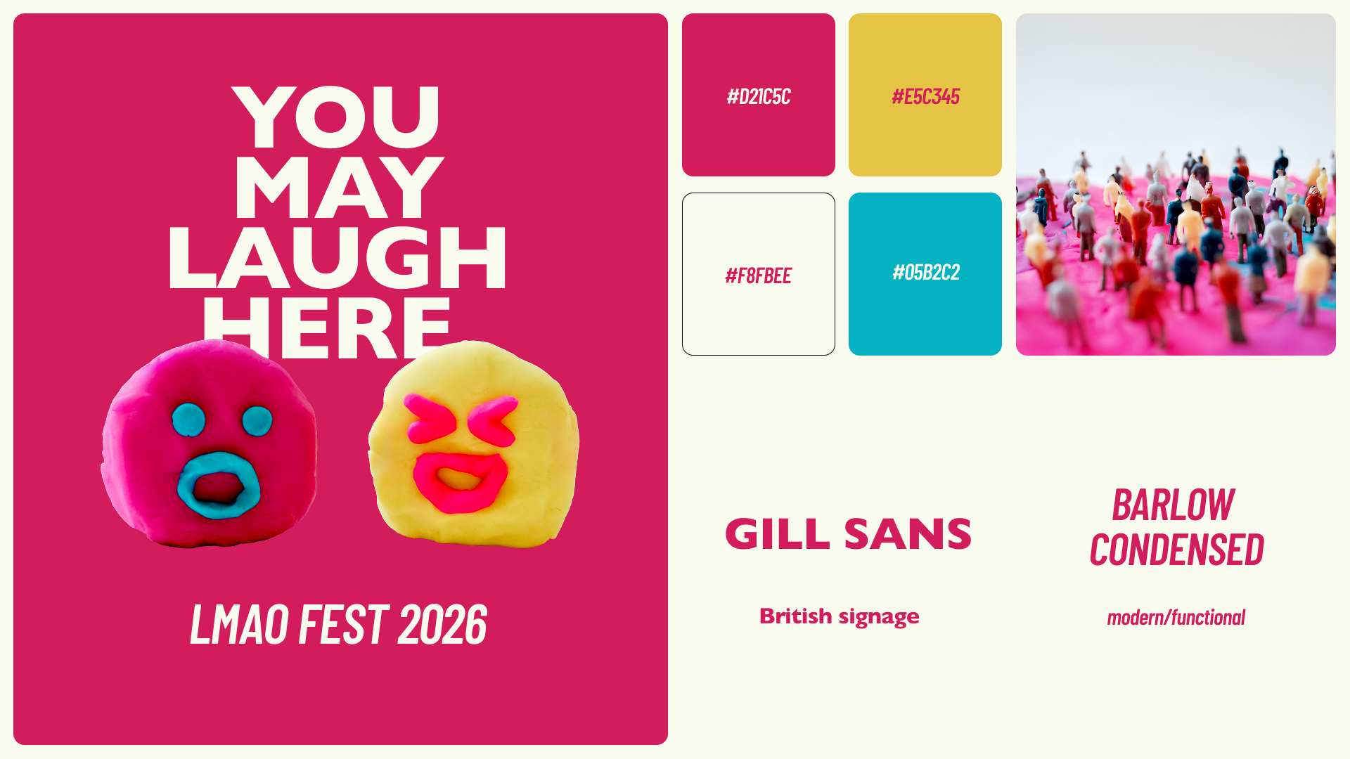
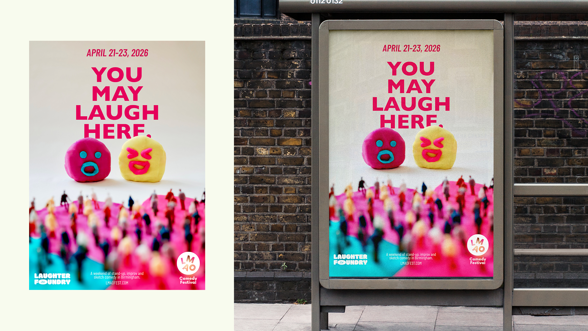
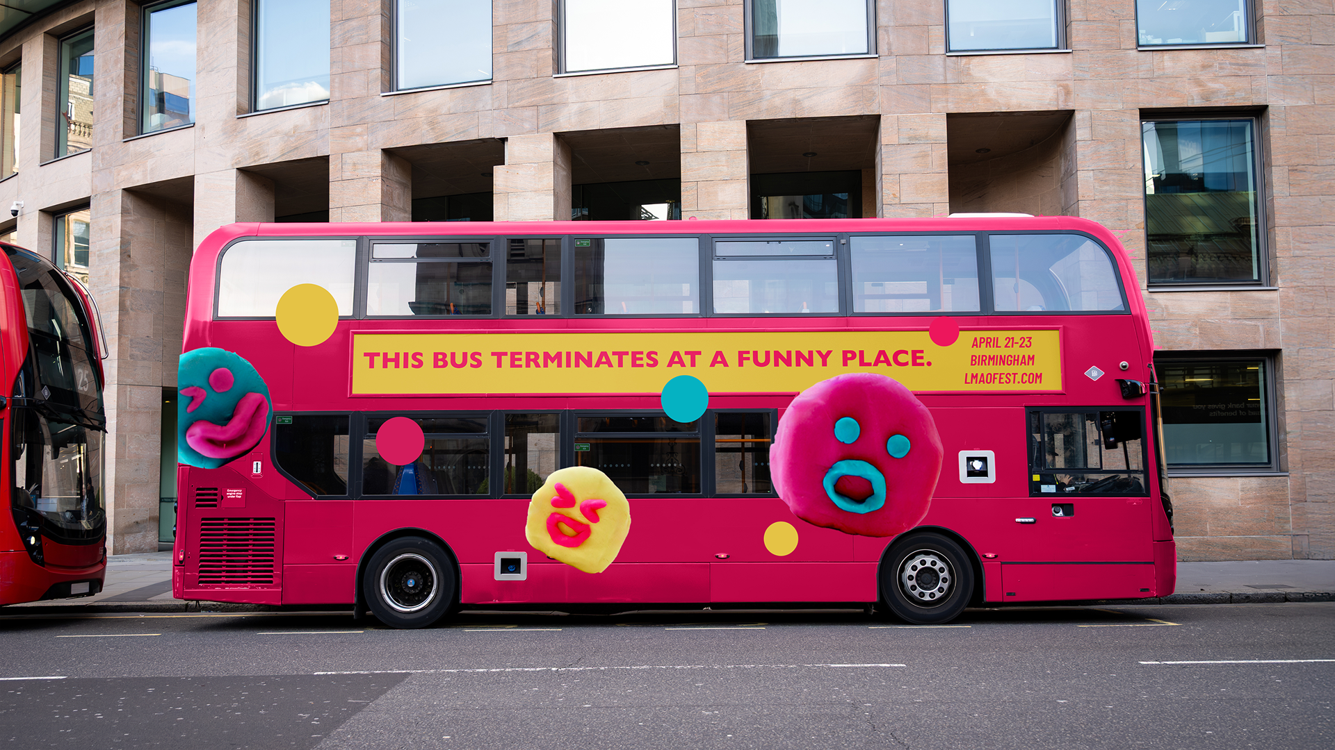
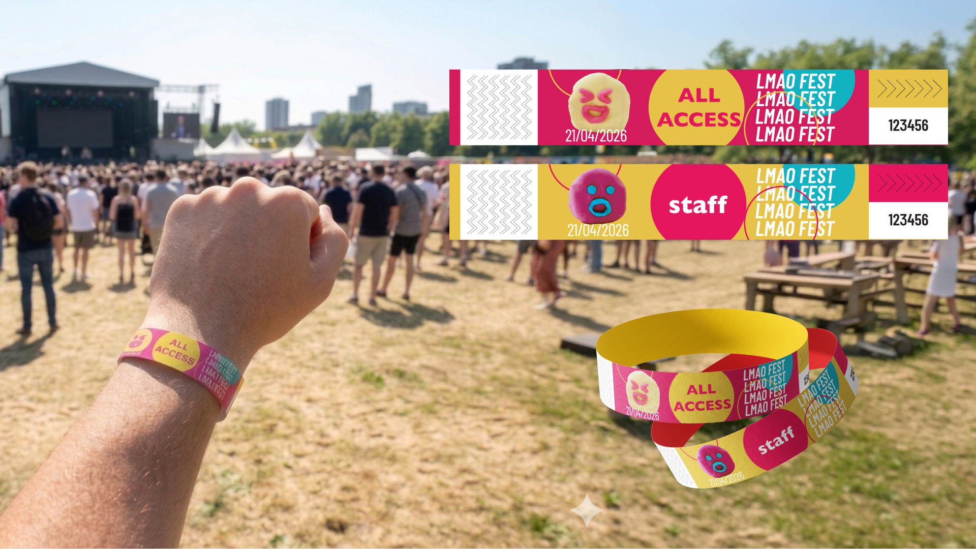
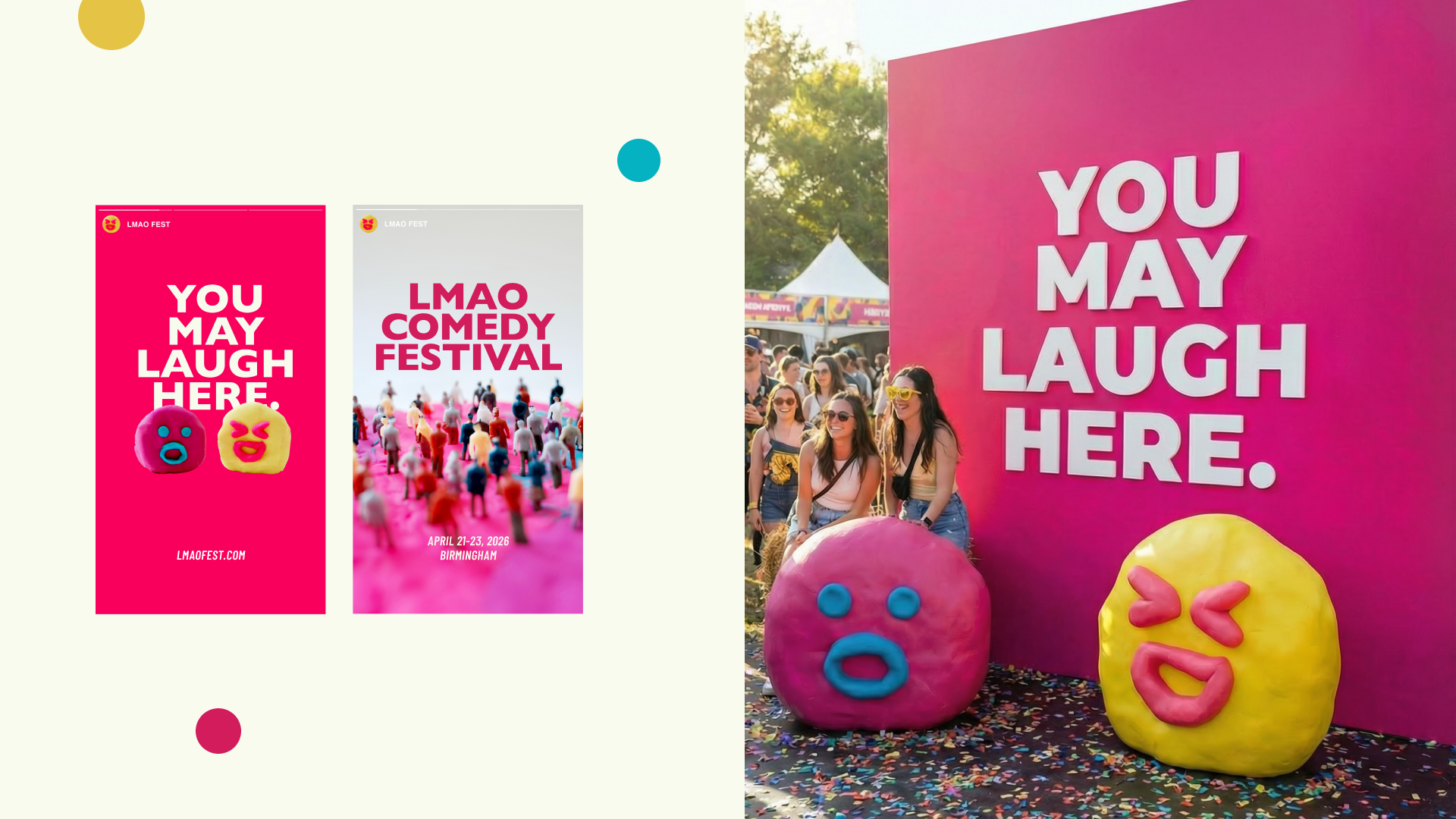
A festival identity for LMAO Fest, a comedy festival built around the idea that absurdity exists within the ordinary. Drawing from the tradition of British comedy, the project explores how the surreal and the real coexist — and how their contrast is what makes something genuinely funny. This tension is expressed through an off-screen visual approach: vibrant colour contrast that creates energy, disproportionate play dough faces that introduce absurdity, and carefully staged miniature scenes that capture a shared, collective experience.