
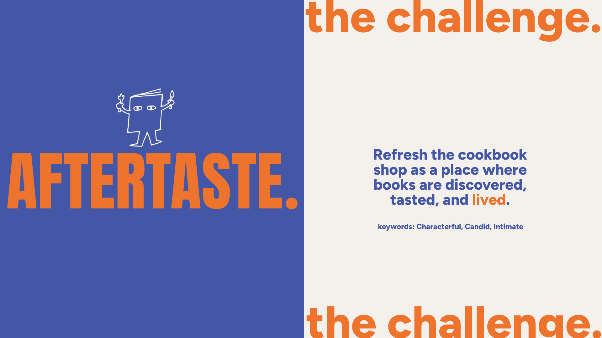
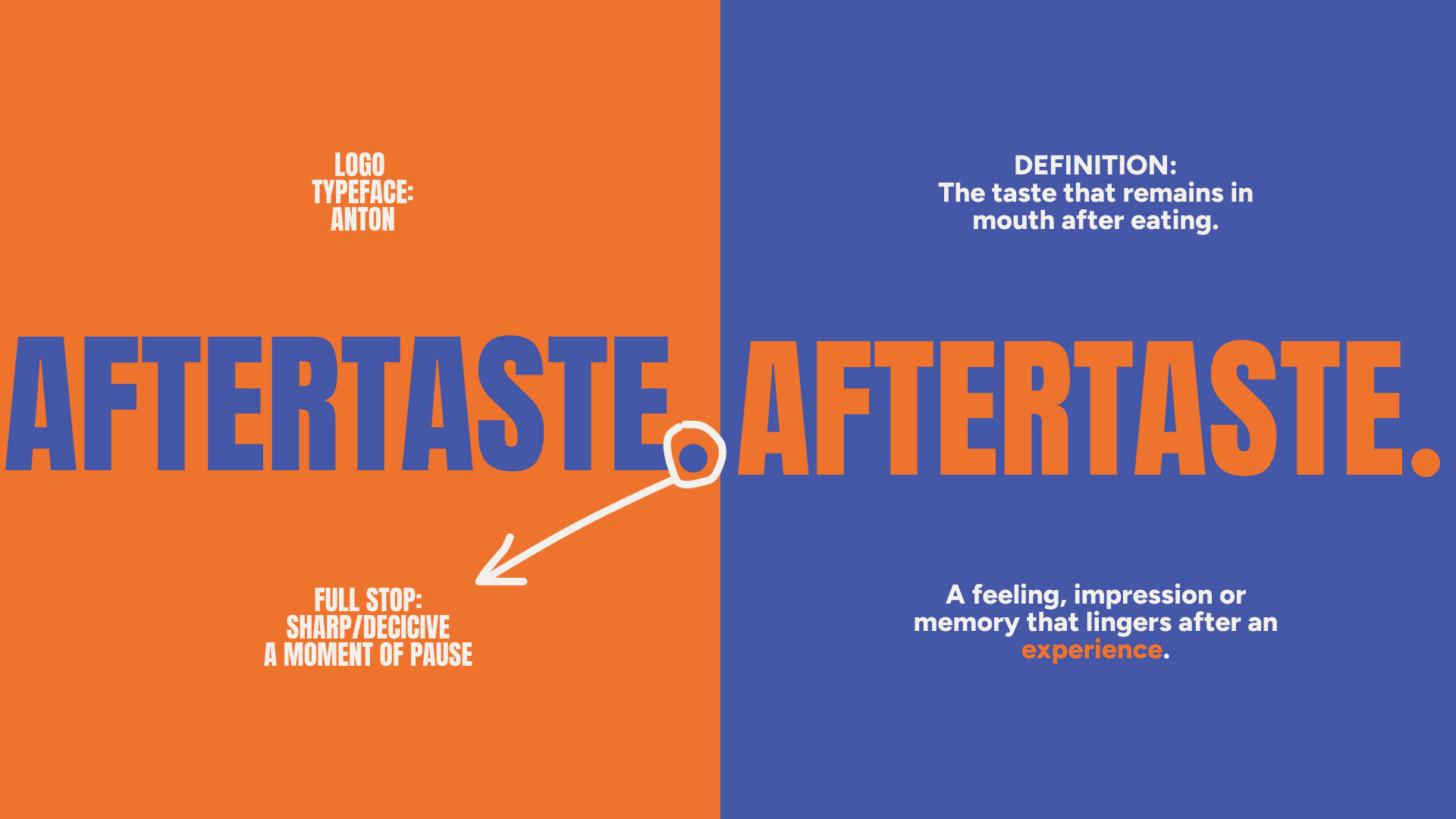
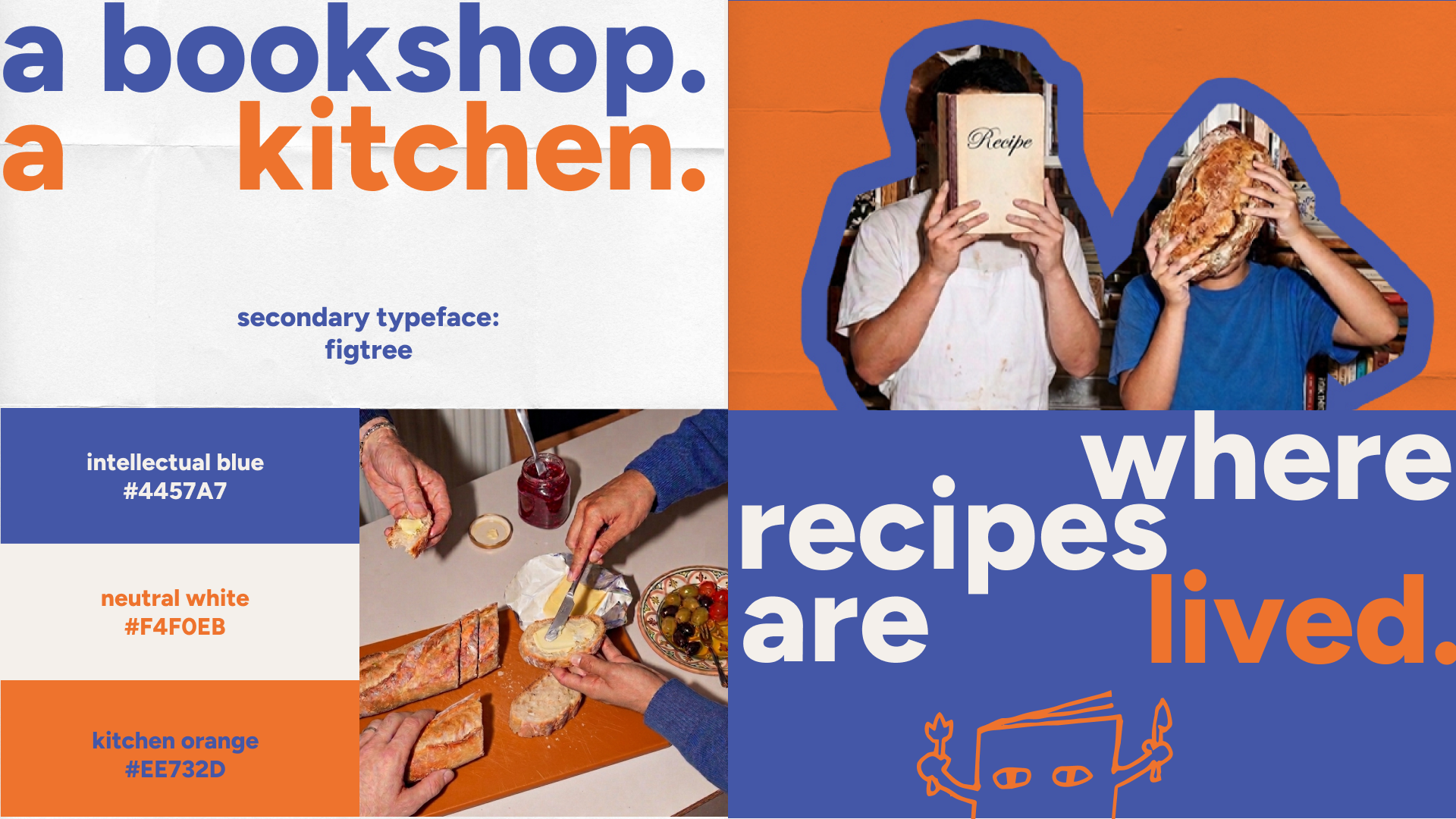
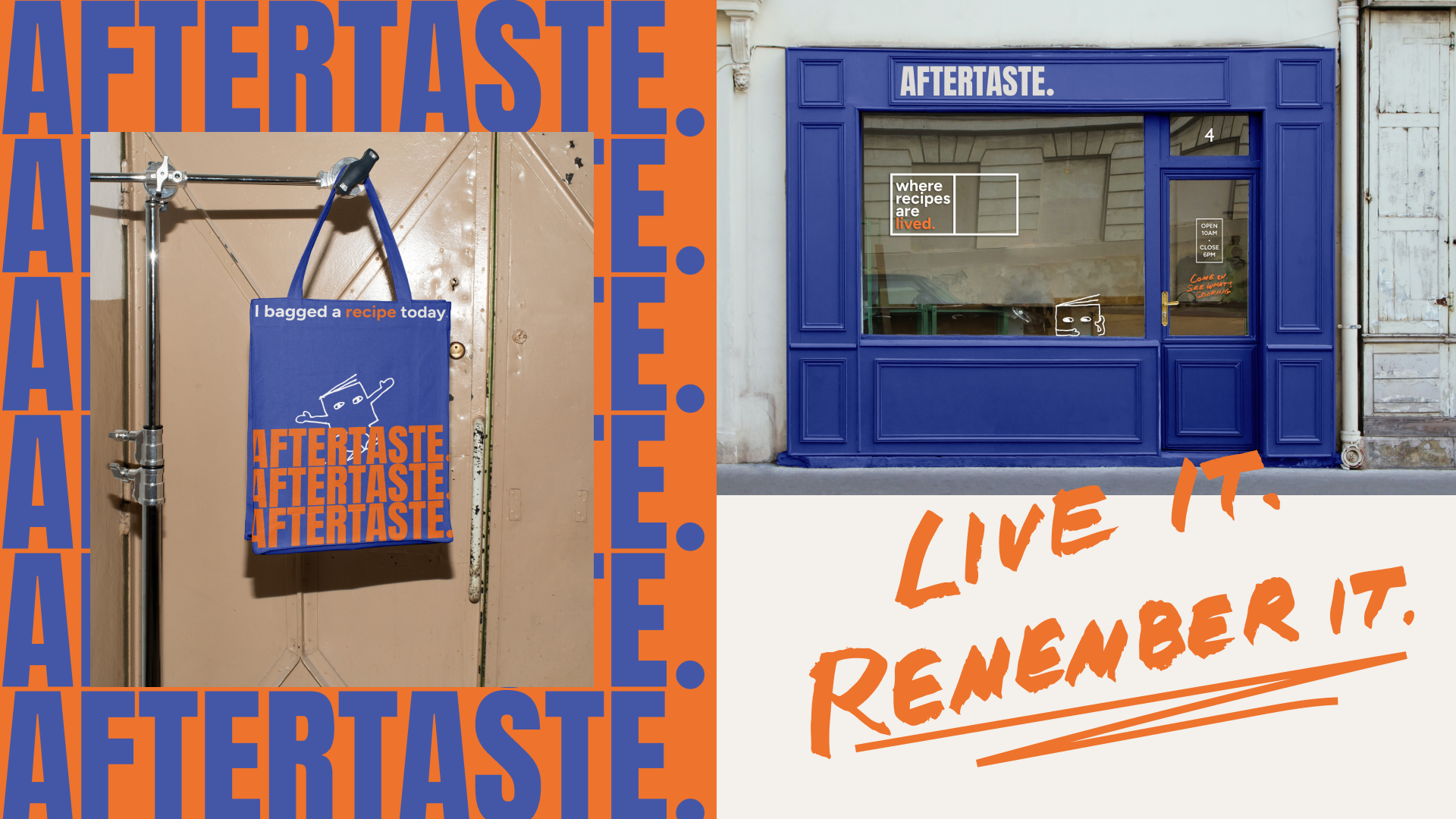
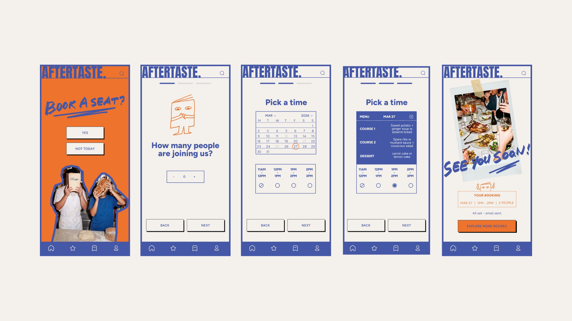
A rebrand of Books for Cooks, reimagining the beloved bookshop as a place where cookbooks are discovered, tasted, and lived. Rooted in the shop's dual identity as both a bookstore and test kitchen, the concept brings recipes off the page and into the room. Three visual keywords shape the direction: Characterful — bold, condensed typography; Candid — real, unfiltered photography; and Intimate — brought to life through Bob, an original hand-drawn character created to give the brand a warm, personal soul. The project also included a digital booking feature, designed to address the shop's long daily queues and streamline the visitor experience.
Conceptual project : Shillington brief and self-initiated project.


This project is a self-initiated student rebrand developed for portfolio purposes and is not affiliated with or commissioned by Books for Cooks.