Conceptual project : Shillington brief
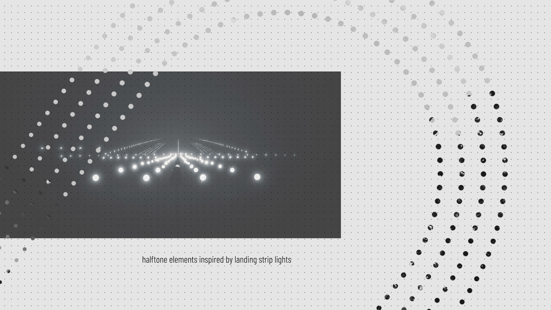
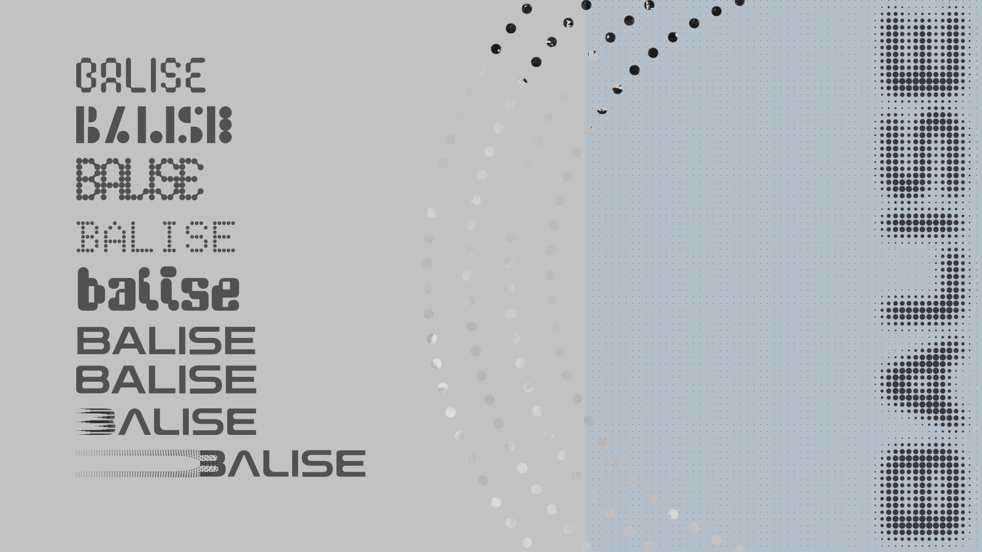
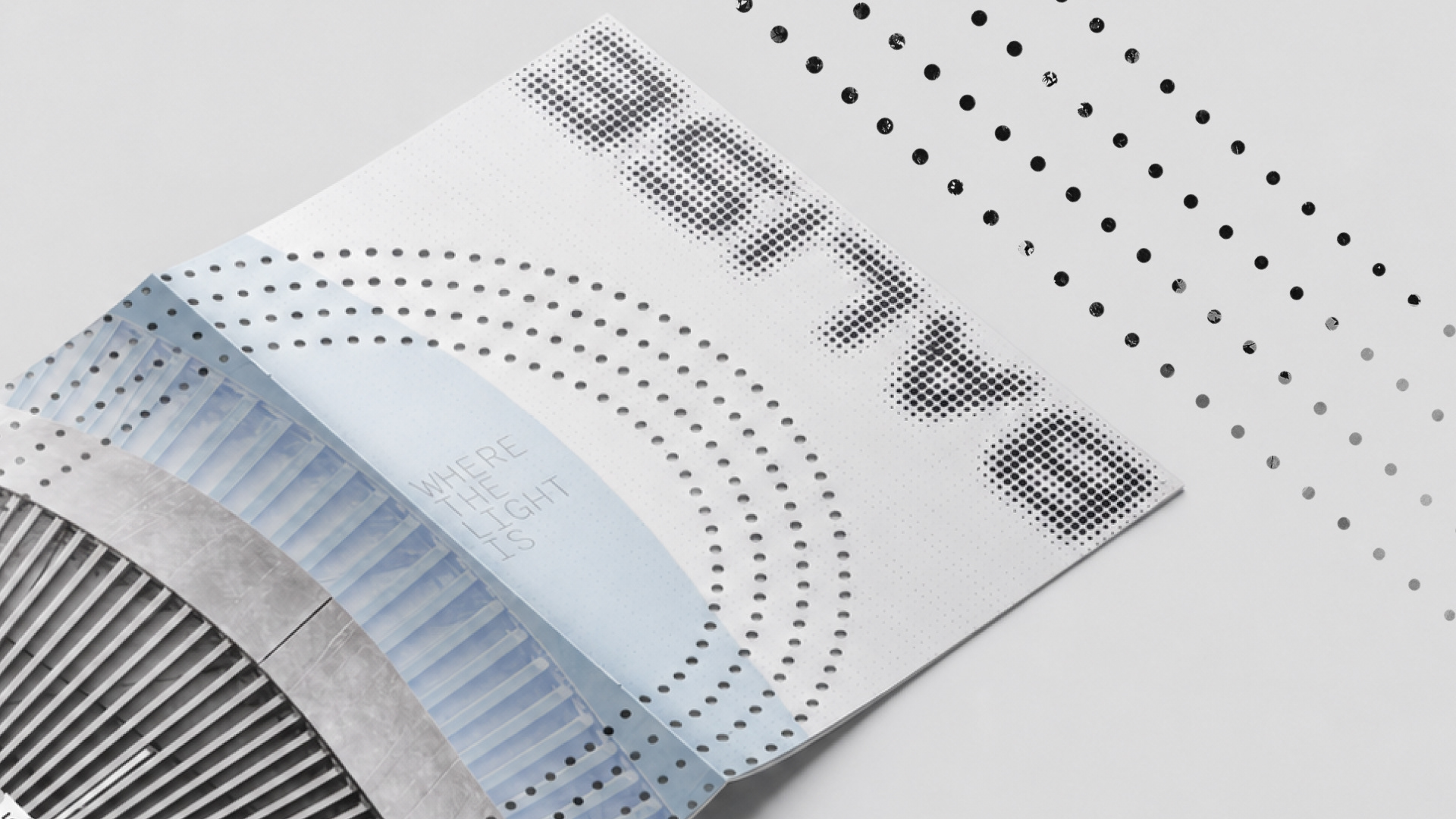
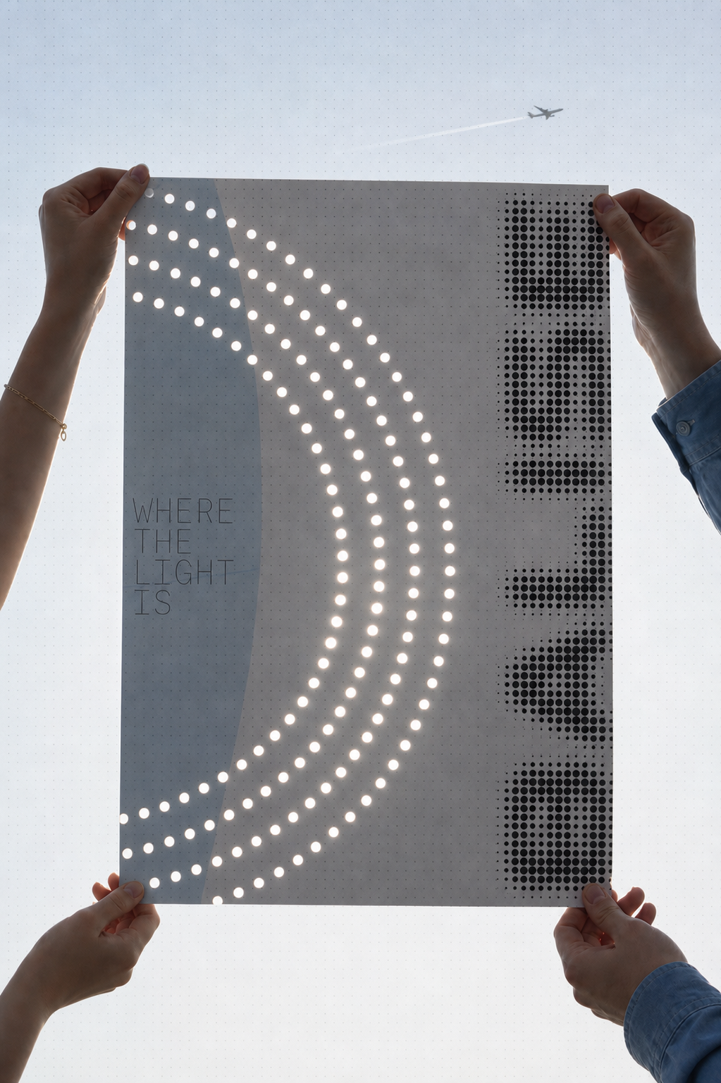
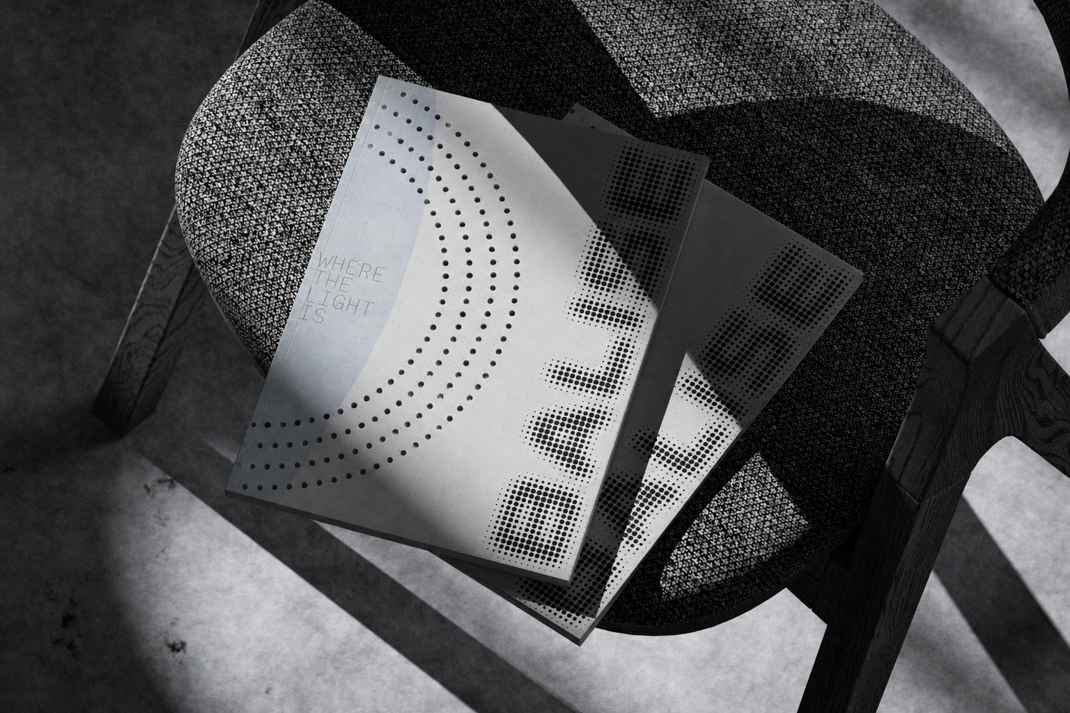
A brochure design for Balise, a residential property development built on the site of a former airbase. The name — derived from the French word for "beacon" — became the foundation of the entire design direction, drawing on the imagery of illuminated runway lights and landing strips to reflect a sense of guidance toward a harmonious, forward-looking future. Three visual keywords shape the identity: Futuristic, Harmony, and Clean. Halftone graphic elements echo the rhythm and glow of runway lights throughout the layouts, while a NASA-inspired sans serif defines the typographic character. A muted grey-blue palette completes the system, evoking the openness of the sky and lending the whole thing a calm, refined atmosphere.