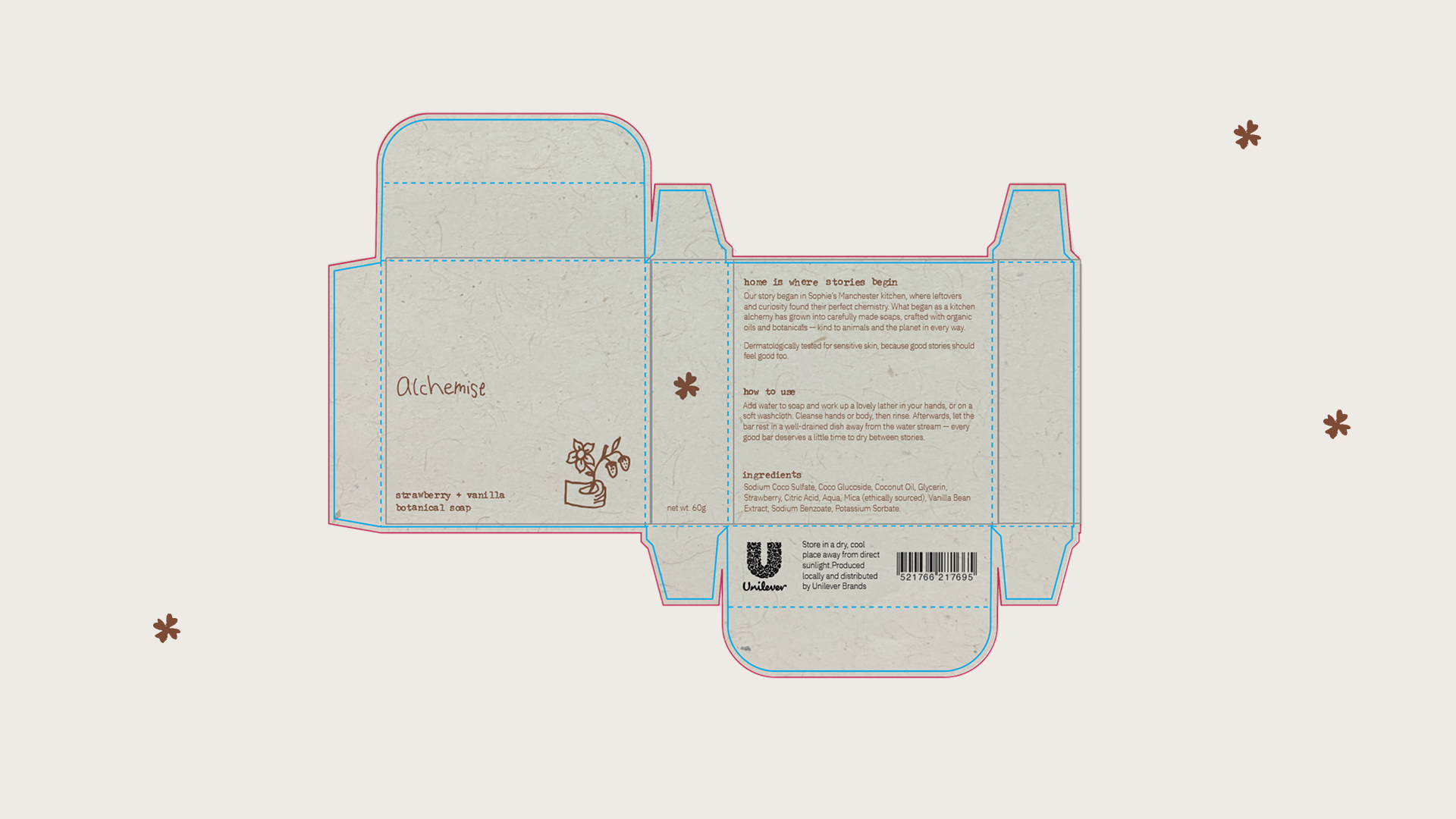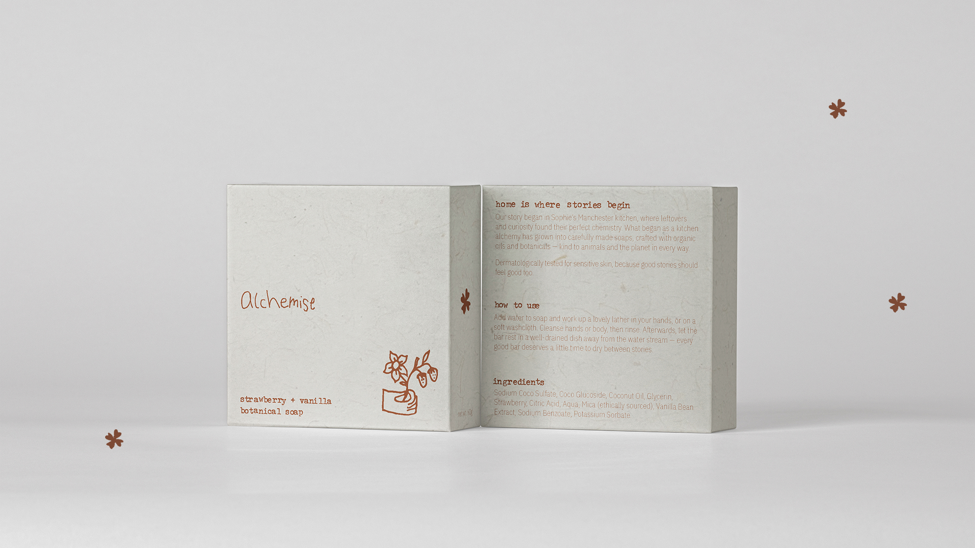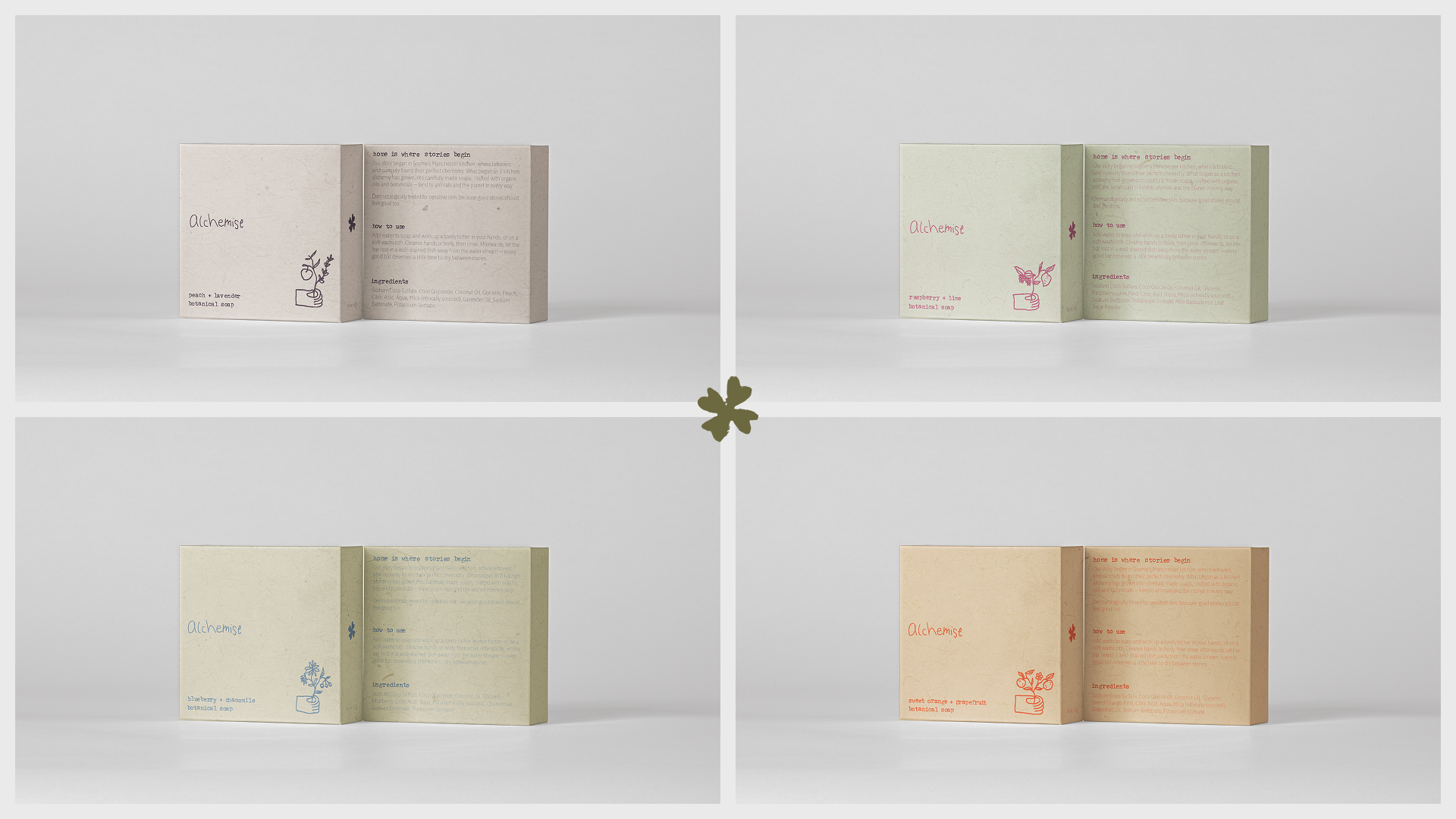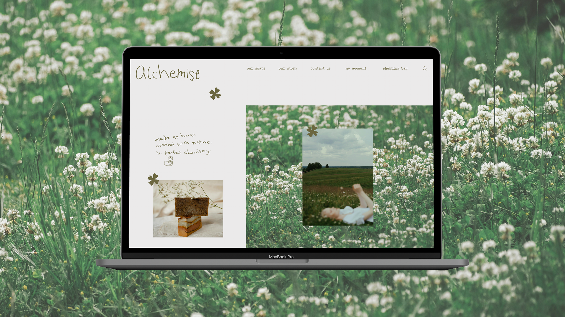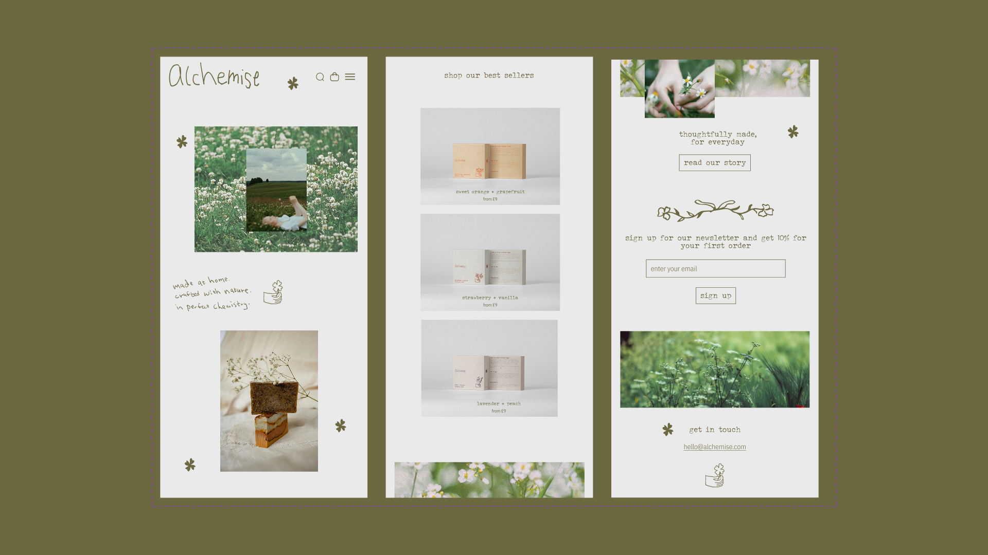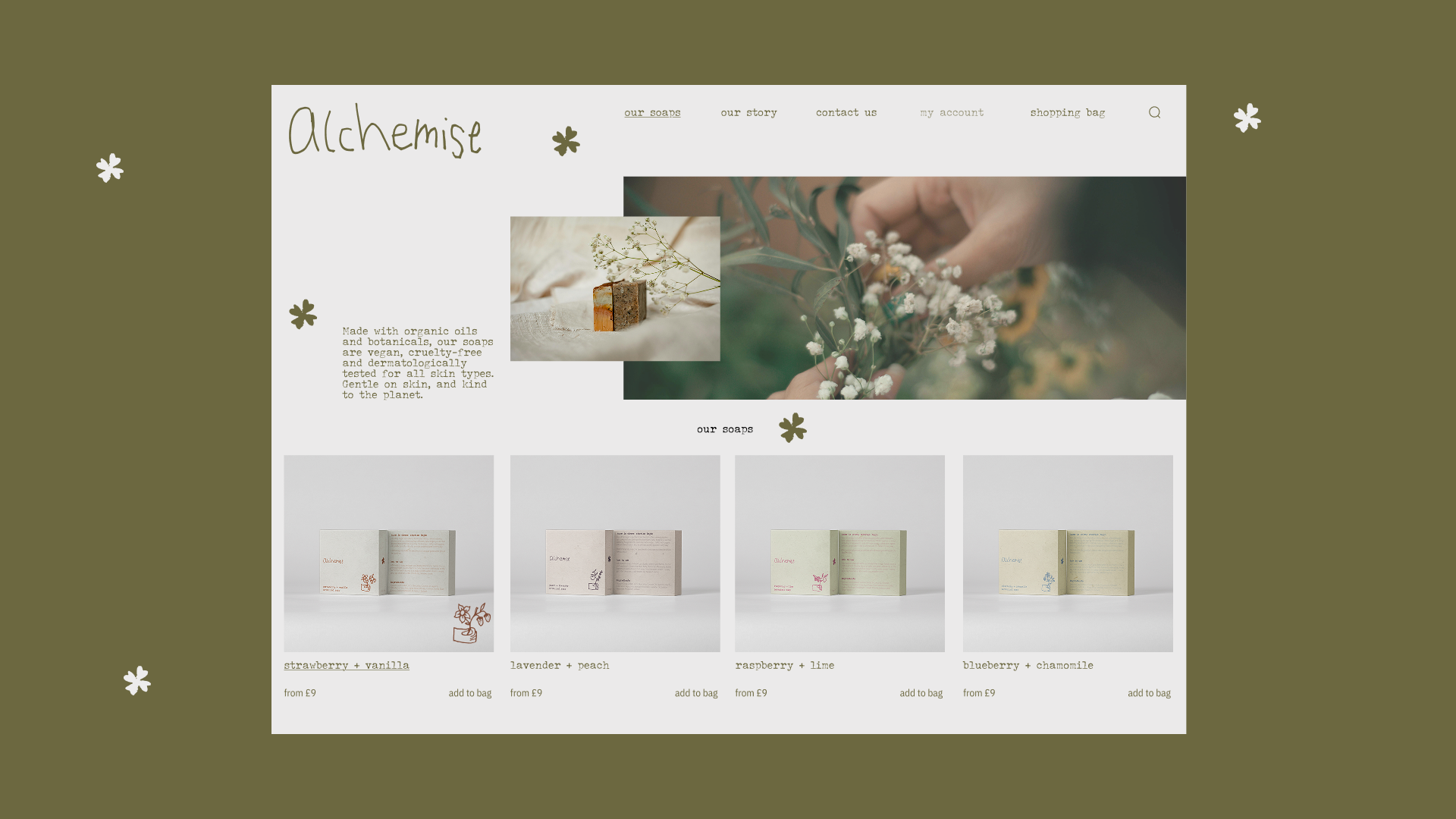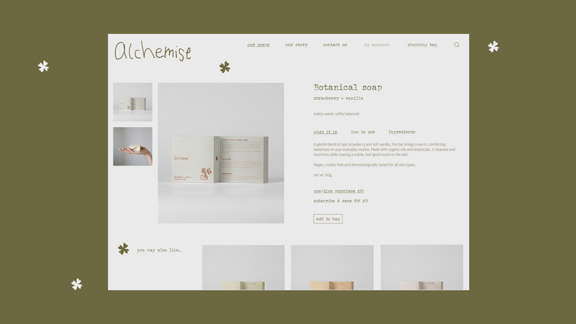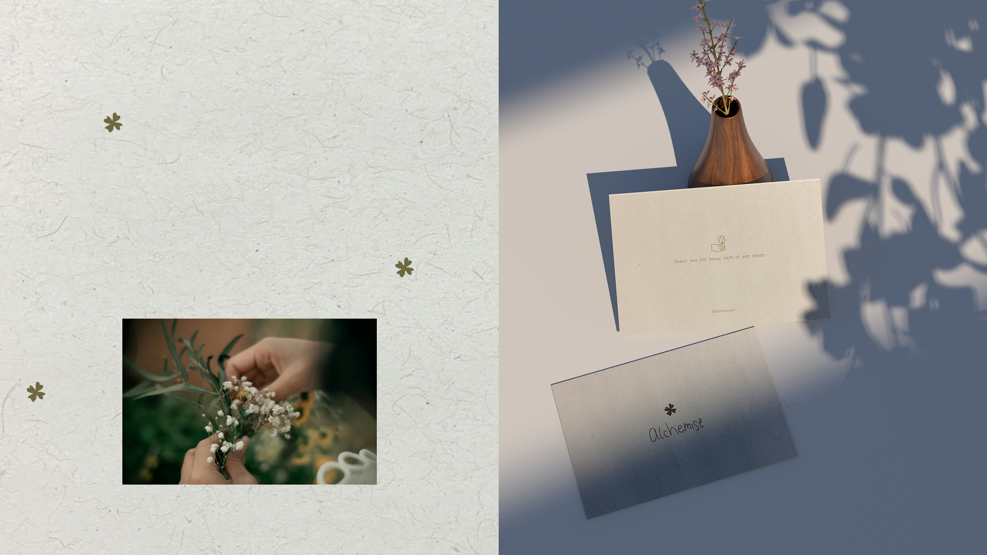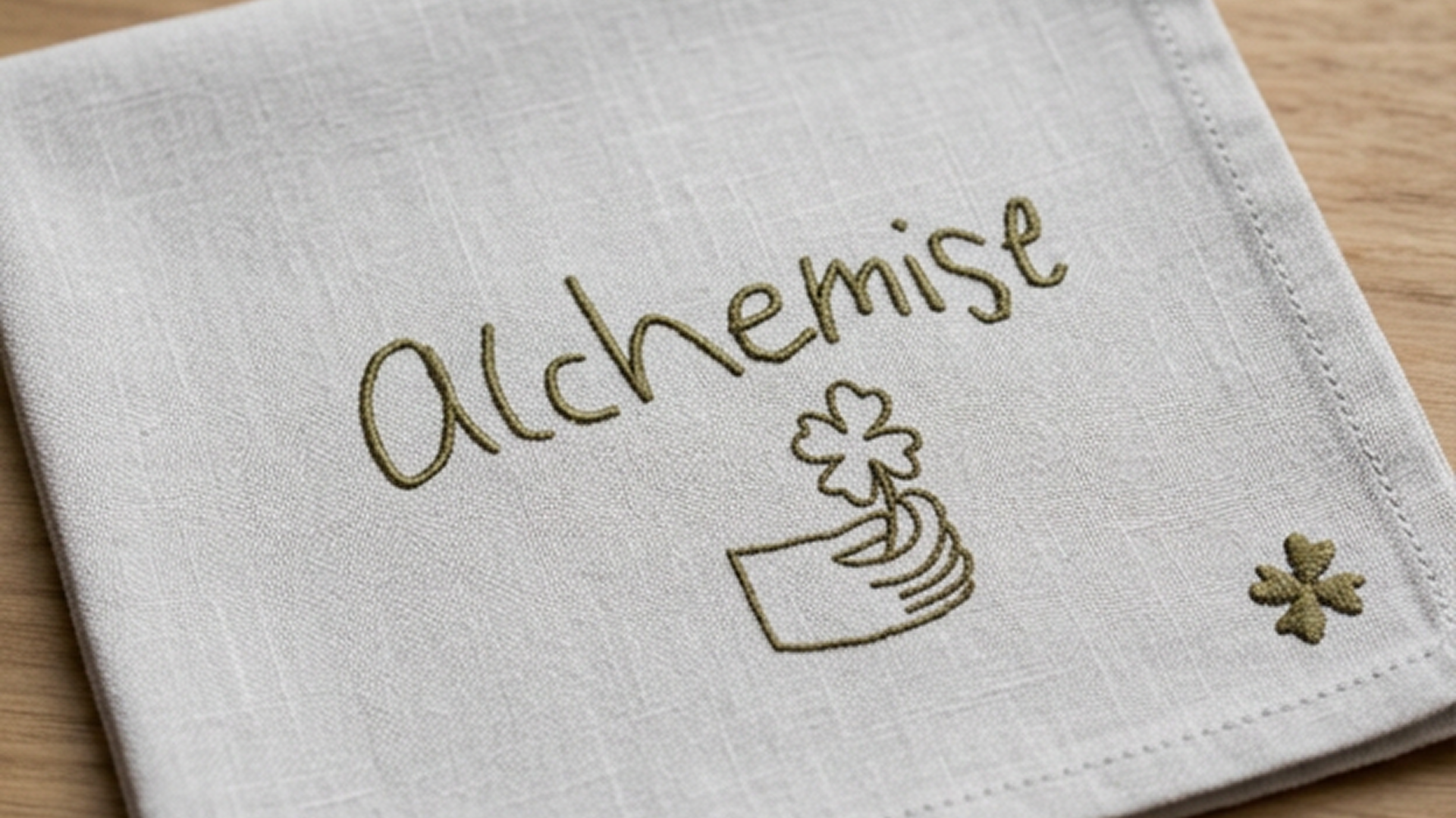
Conceptual project : Shillington brief
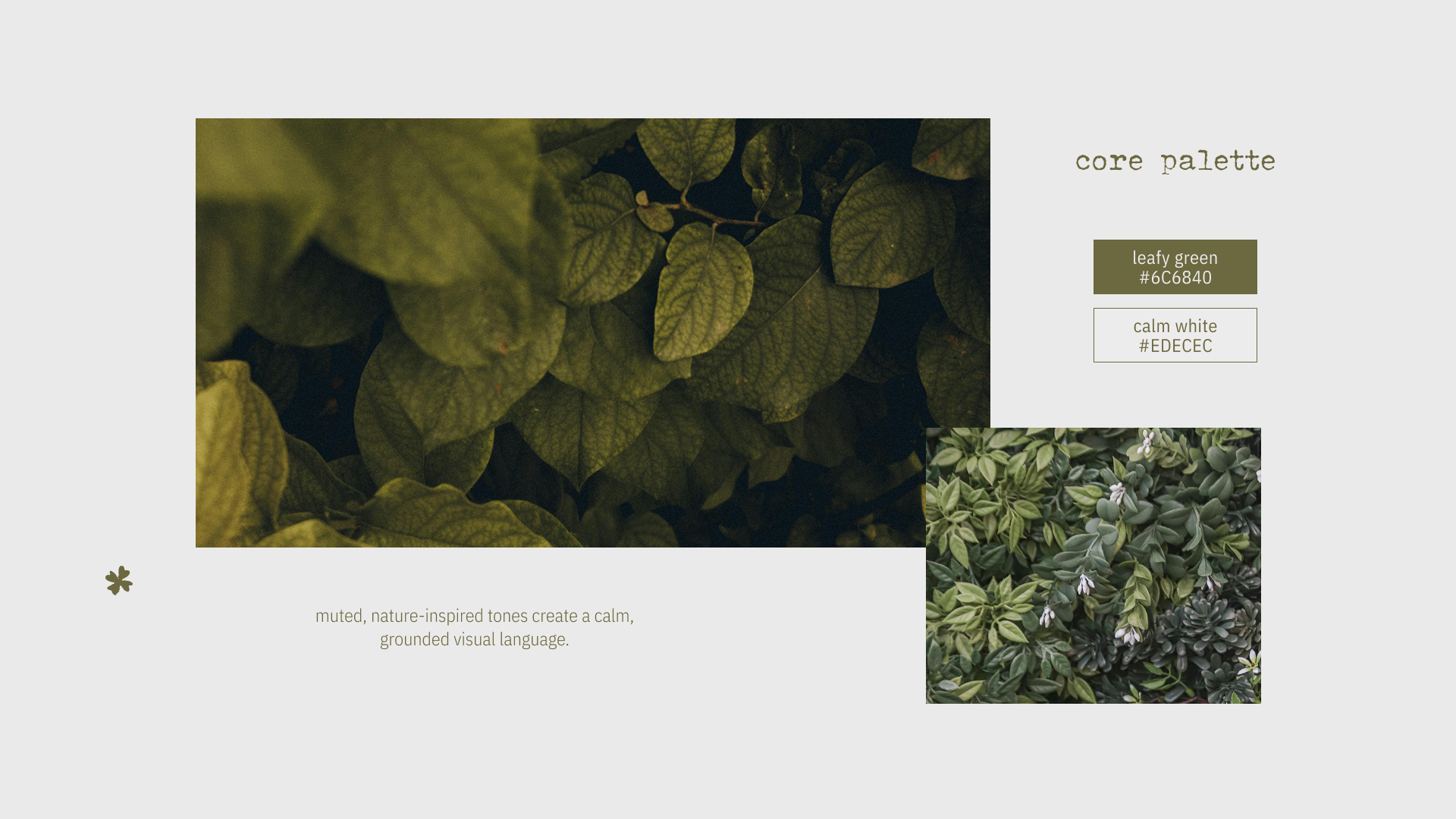
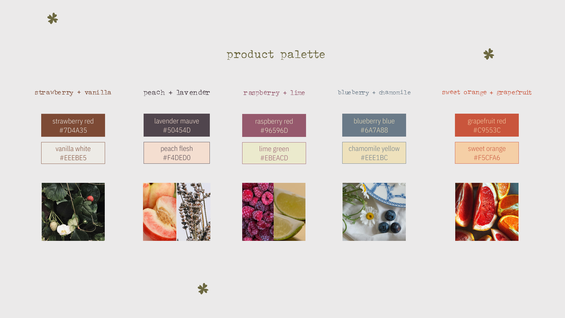
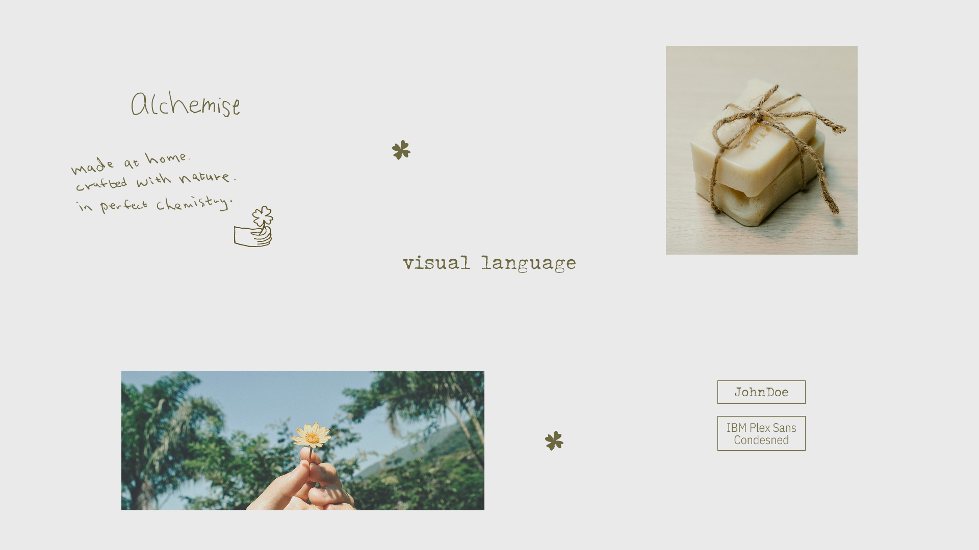
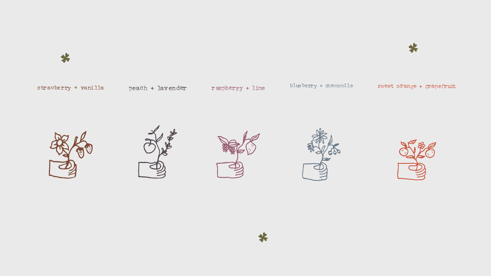
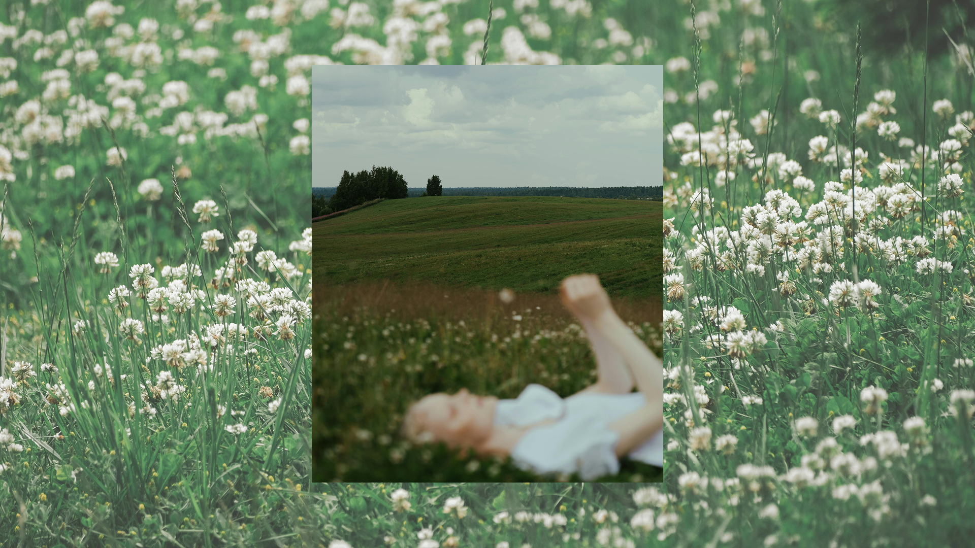
A packaging and brand identity for Alchemise, a home-grown soap brand from Manchester. Inspired by the brand's origins in a home kitchen, the visual identity is rooted in the idea that home is where stories begin. This narrative is expressed through a minimal, earthy system — typewriter-inspired typography, a nature-drawn palette, and hand-drawn elements that together convey warmth, craft, and individuality.